WordPresto
Web Application & Marketing Website
WordPresto bridges the gap between DIY website builders and fully tailored solutions, offering a unique website-building platform.

About The Project
Background
After creating a few thousand websites and concurrently hosting several hundred, the company encountered several challenges in managing that volume of clients with a smaller team. They wanted to scale but realized they couldn’t do so with the current processes and systems in place.
Even though they were using project management software, it lacked the necessary functionality for website-style projects. A large portion of the projects still required manual management of assets and information. They began evaluating new project management systems, only to find those lacking as well.
Scope
My team and I were tasked with creating a brand new B2B web application and marketing website. The goal of the application is to allow clients to have a website created and hosted for them through a more streamlined and automated process.
Our work encompassed:
- Brand Development
- Planning & Discovery
- Web App UI & UX
- Including Client & Admin Views
- Marketing Website
- Working MVP of the App
My Role
My role in this project was to spearhead the creative, as well as contribute to product ideation and the overall product roadmap. Due to the large scope of this B2B platform, we implemented many creative interface solutions that allowed users to easily communicate their desires and tailor their website to match their brand and ultimately their vision.
The product also featured a communication component and a comprehensive admin panel, enabling project managers to oversee the entire website lifecycle from checkout to launch.
Another aspect of the project I was responsible for was creating the marketing website which was created in WordPress.
Approach
Working with several project managers and some clients we discovered that the company had a very solid workflow they were following but lacked the tools to support it. With that said, the end to end workflow was very large and had a lot of exceptions.
Our first step was to outline the entire website lifecycle, from initial contact and billing to launch and maintenance. We identified areas that could be automated and made suggestions for improving the workflow.
For each major section, we started building out the UI in Figma while the developers began architecting the backend. We worked directly with the project managers to ensure we designed the interface to optimize their workflow and address their most pressing pain points.
Following stakeholder approval of any section of the UI, developers integrated it into the application. Designers and developers worked hand in hand throughout the entire process until a working beta was ready to be distributed to a select group.
We decided the best approach was to break down the application into four major parts:
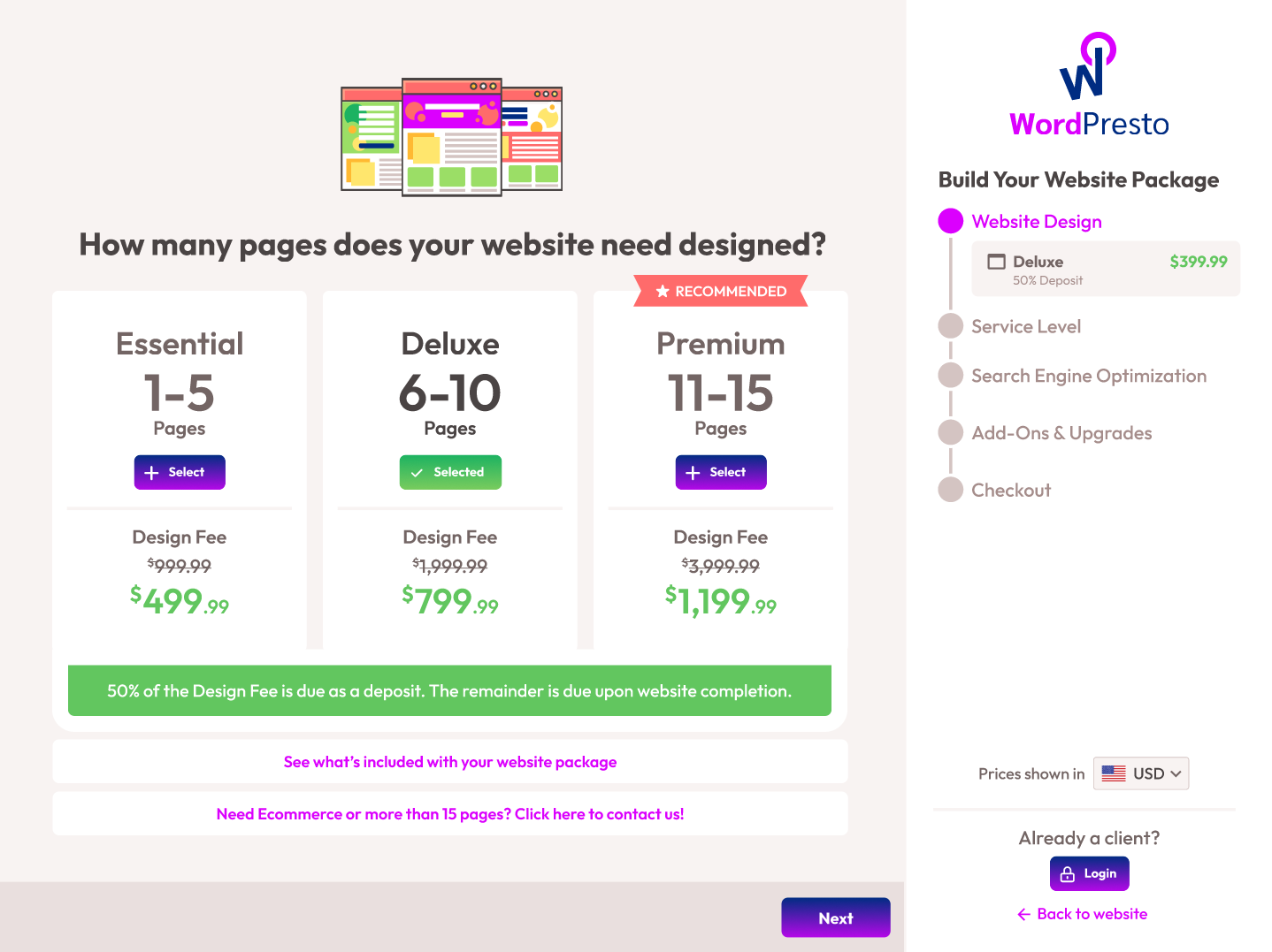
1. Checkout
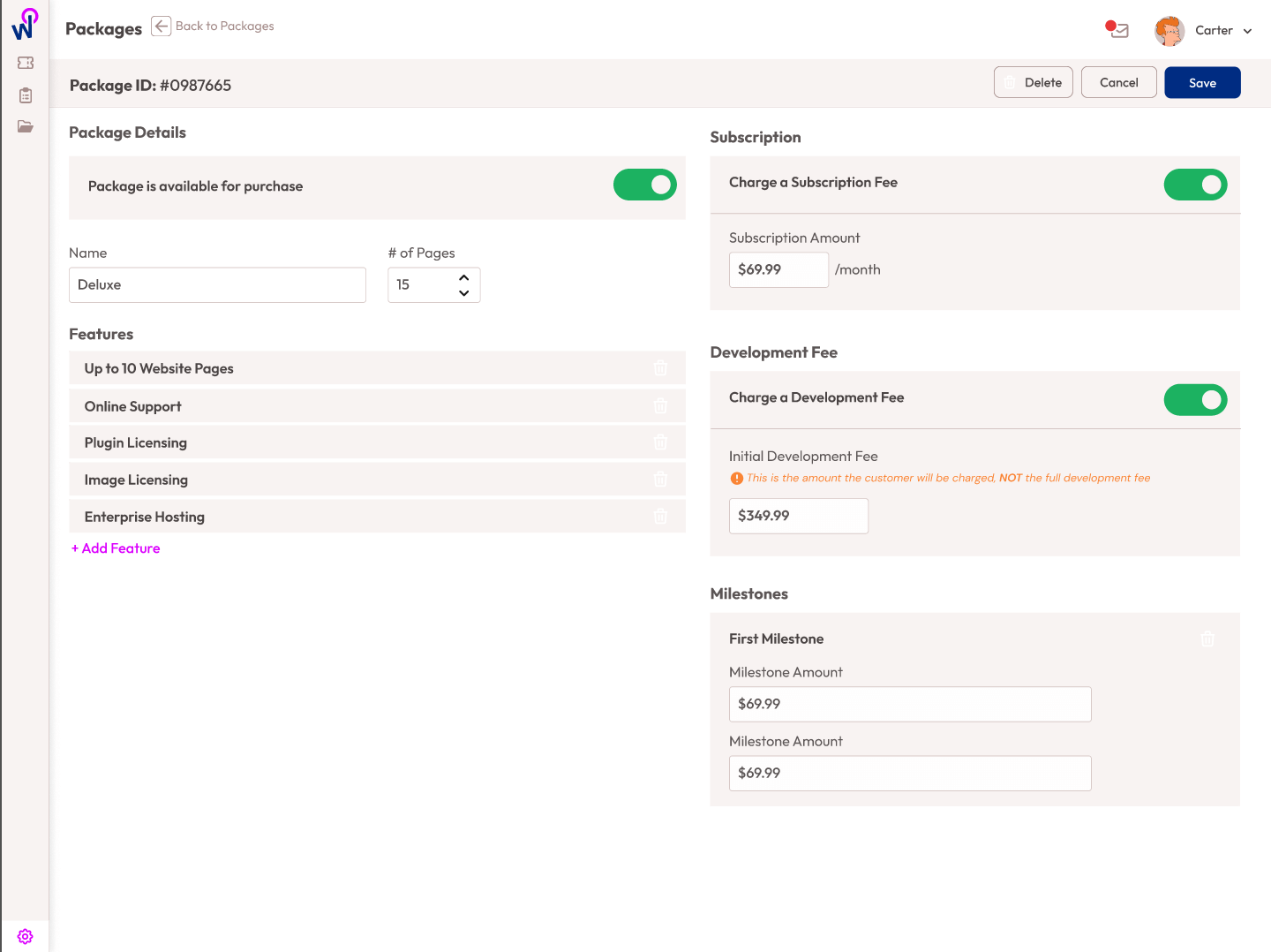
The current billing process for clients was tracked manually in a spreadsheet. The company decided to adopt an updated billing model, allowing clients to build a package that suited their needs. Most importantly, they wanted their billing to be fully automated.
We implemented a step-by-step, click-and-pick checkout process, enabling users to focus on one part at a time. Their packages needed to include the number of pages, the level of support, and any add-ons.
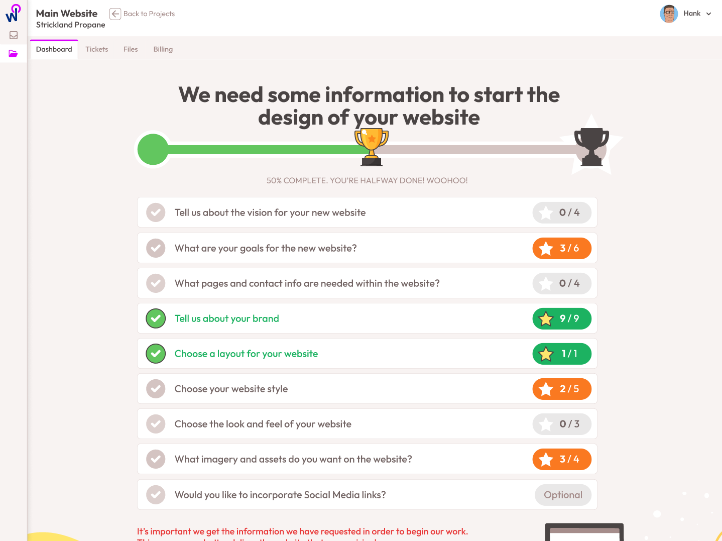
2. Initial Information Collection
In the existing workflow, all clients are required to fill out a questionnaire and provide specific pieces of information before the design process begins.
We debated whether to enforce a linear, step-by-step information collection process, but certain pieces of information, like image uploads, could have significantly slowed down the project.
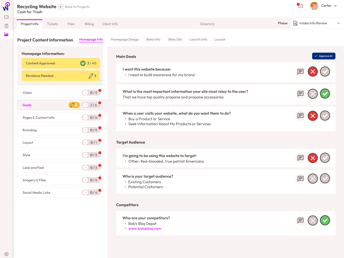
We determined that the best way to collect this information would be through a virtual task list available on the client’s dashboard. This also includes sending reminders to clients about any outstanding information.
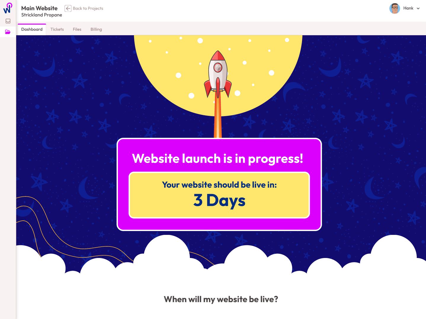
3. Website Creation & Launch
Since the company had perfected the process of making websites, it made the most sense to approach the creation of the website in a linear fashion.
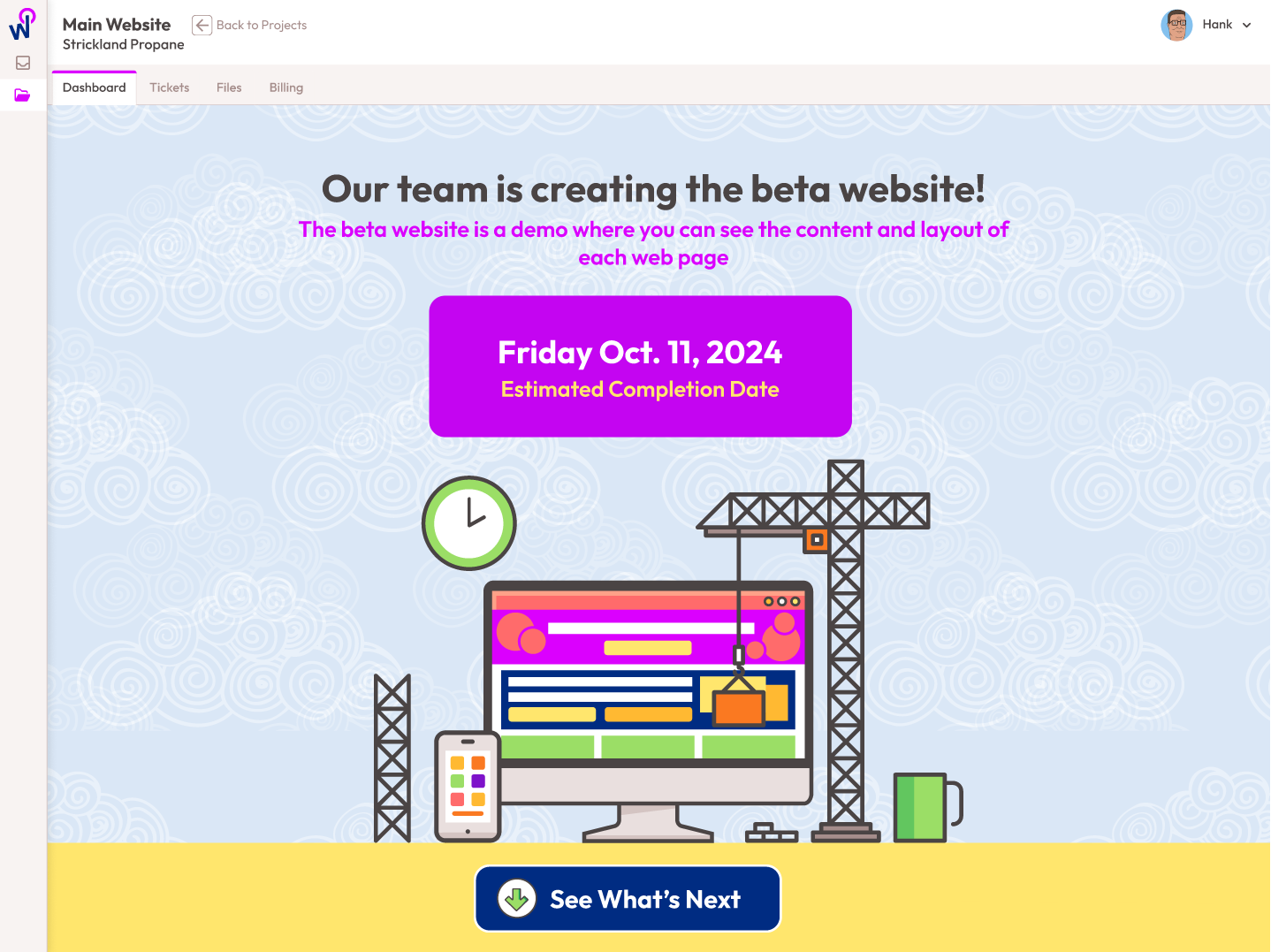
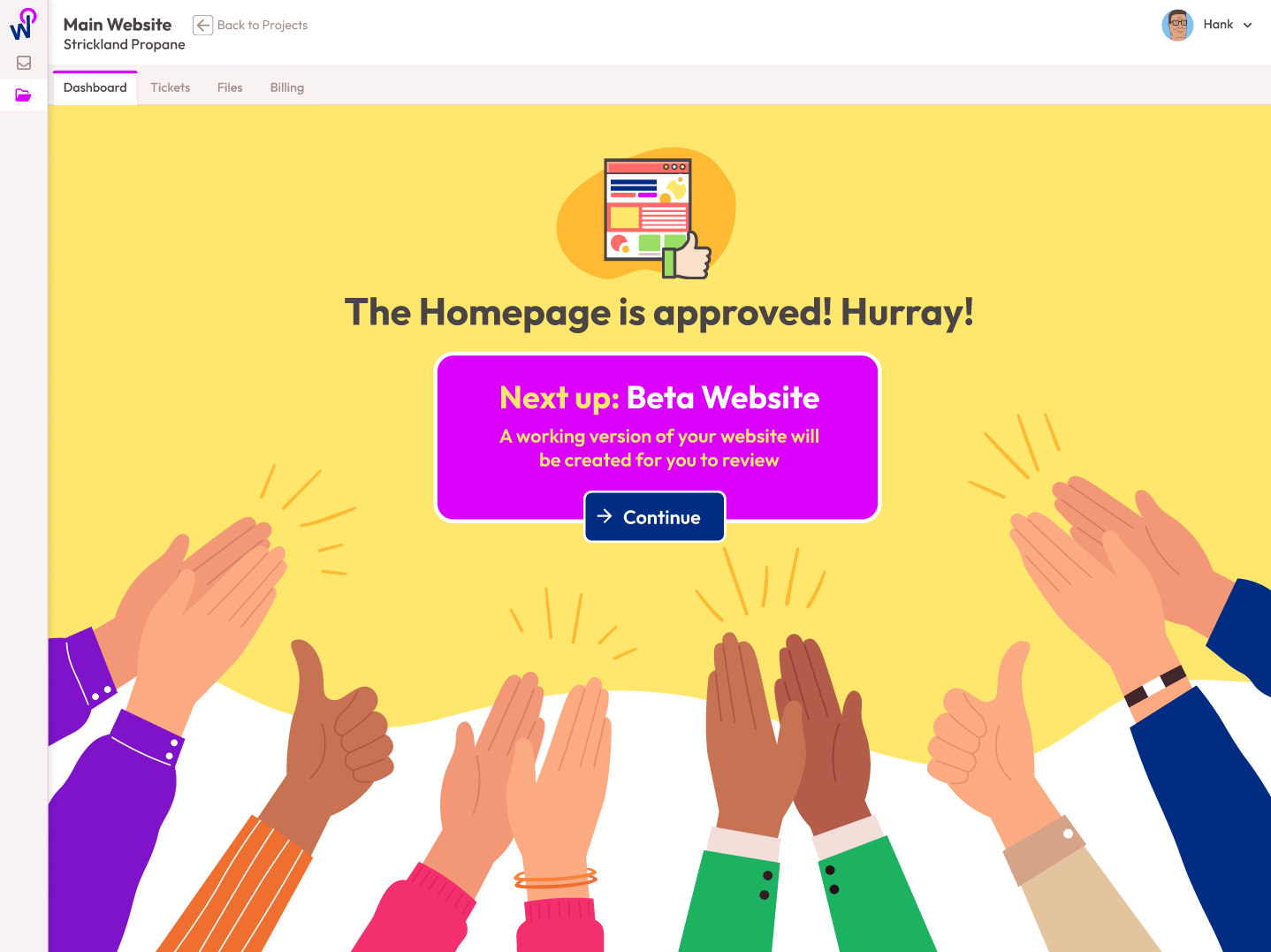
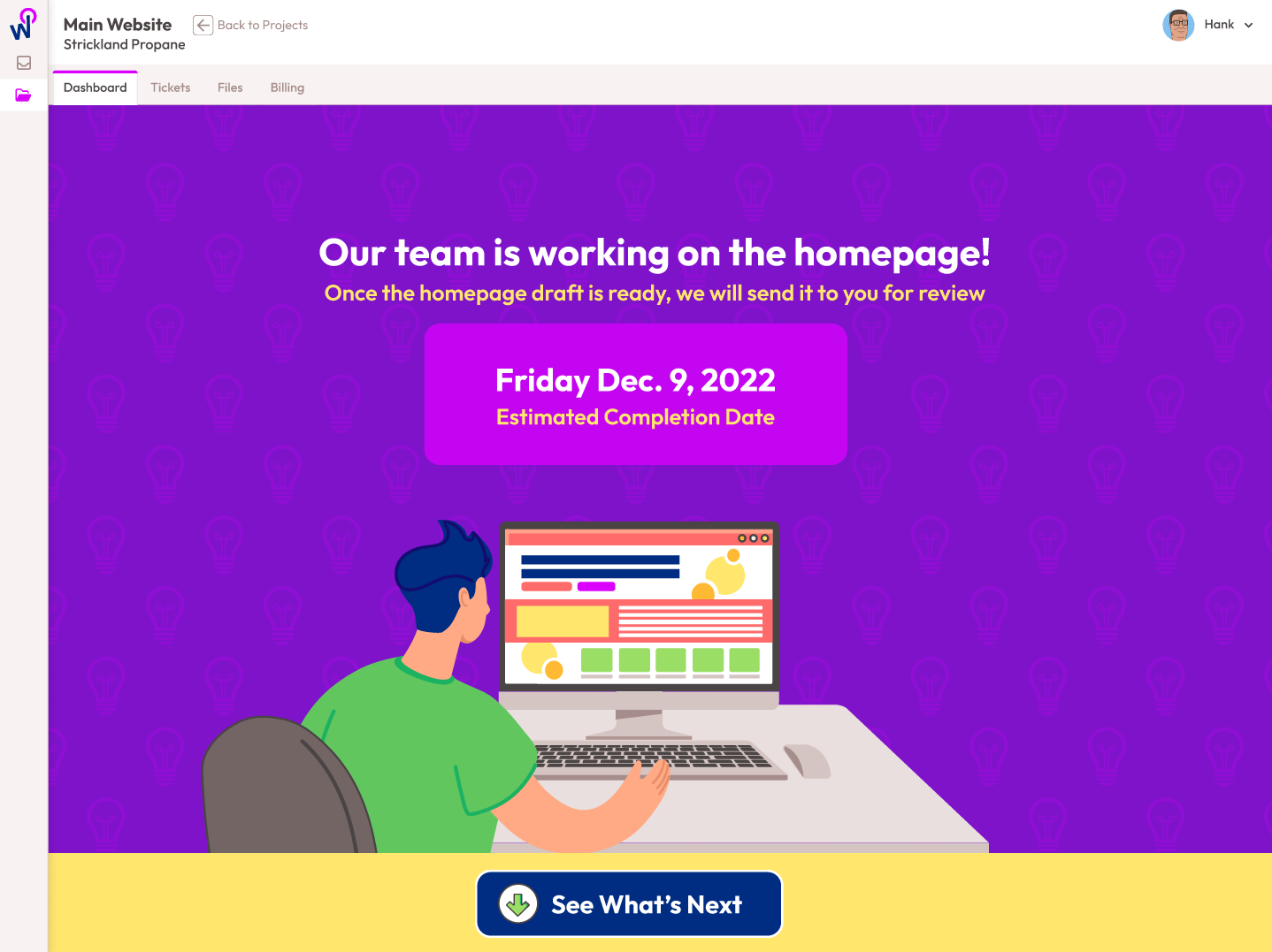
The goal of the website creation process was to keep the client informed at every step and to clearly indicate when their participation was required.
The process needed to be very easy for clients to follow. The interface achieved this by utilizing focused screens and a streamlined design
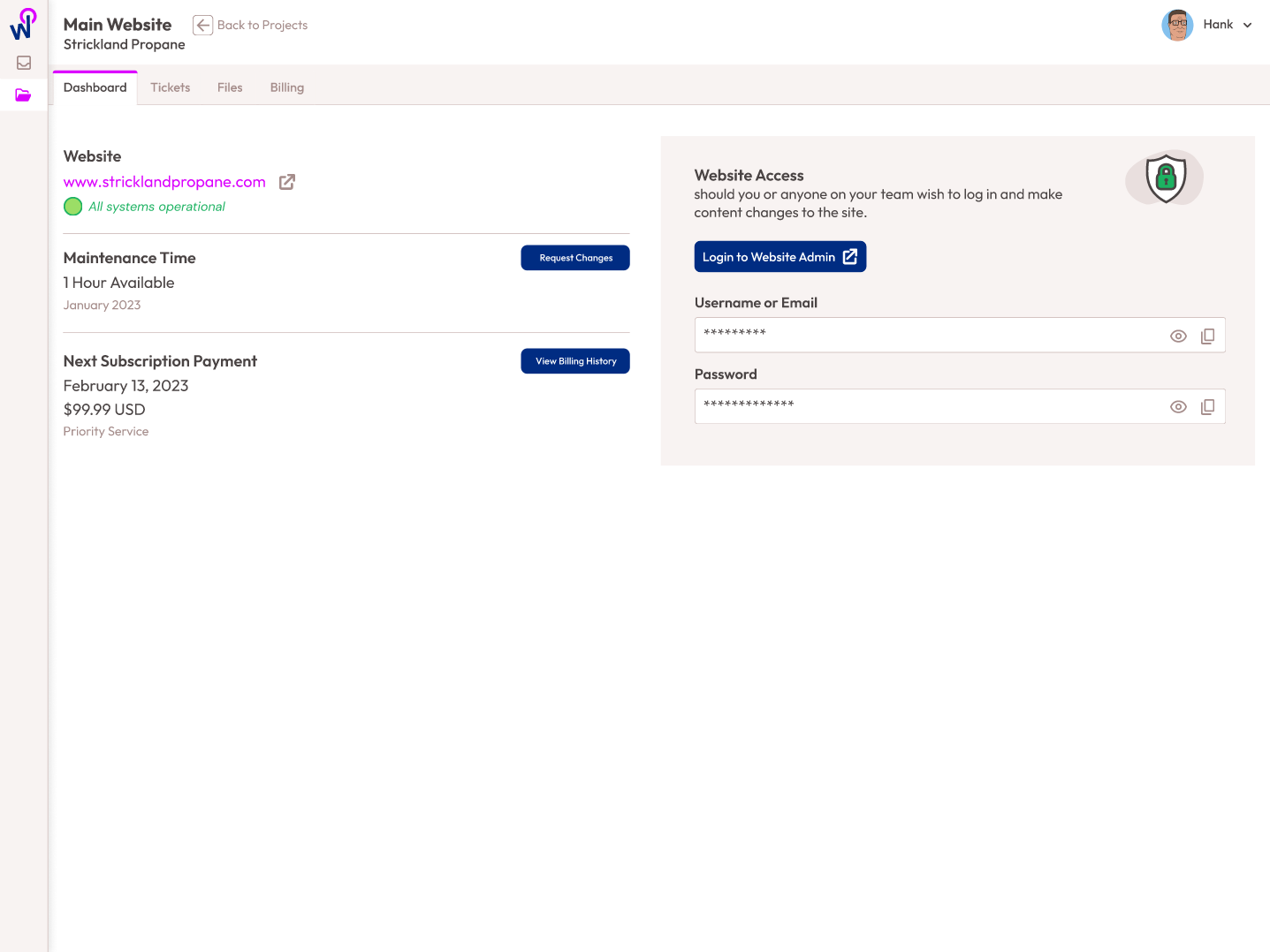
4. Maintenance & Support
Managing several hundred live websites at once was becoming overly tedious. Since only 11% of clients were using their monthly hour of maintenance and even that volume of work was difficult to manage, we made sure that change requests and monthly billing were all automated.
We also ensured that clients easily know the status of their website, billing and monthly maintenance allotment.
Challenges
Communication & Oversight
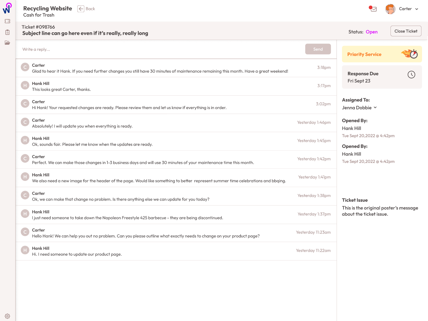
One of the main reasons this project was being undertaken was to keep all communication in one system. The main form of communication was via email, with some clients preferring phone calls and video calls. Over time, managing hundreds of active clients concurrently became difficult and inboxes became flooded and tedious to keep organized. It was also difficult for management to oversee employees or attempt to perform a retrospective on a client.
that it would be ideal to have all communication managed within the app. No more emails and only schedule phone/video calls. We implemented
After studying the inbox and current communication loop, along with some feedback stakeholder, we came to the following conclusions:
- All communication needed to be managed within the system so that relevant users could easily access the information.
- All communications are timestamped and logged to provide a clearer chronology for each project.
- Email would no longer be used for client requests. Existing clients would need to be informed and trained on this change, as requests via email would no longer be fulfilled.
- Video calls must be booked online by clients, who can select from available time slots. Project managers retain control over the scheduling.
Tracking & Recording Information
Even if a website is only three pages, there is still a lot of information that needs to be exchanged between the client and the project manager. This includes creative feedback, content creation, image and asset management, and much more.
Currently, the project managers were doing their best to juggle all of the information and organize it in a coherent way. A major pain point was that nothing was standardized. Some clients would send handwritten notes in PDF format by email, while others would send links to their Google Drives with images that contained large print files.
All of this was done manually and involved a lot of copying, pasting, and uploading into the project management system. Another issue, on top of just getting the information, was the accuracy of what was provided, which resulted in endless email chains requesting clarification.
Keeping Things Simple
Right out of the gate, we knew we would need to convince users that the app was legitimate. Since the app was in the freebie/contest space, it could easily be perceived as a scam.
To overcome this, we aimed to do the following:
- Ensure the design was professional and clean, but still fun.
- Be as transparent as possible with users about the collection of their information.
- Include a section showcasing real winners of real prizes.
Features
Easy Checkout
The checkout process was streamlined so that clients could easily pick exactly what features they need for their website, no more no less.
Easy Information Collection & Storage
Since we asked for more information than typical apps, we broke the sign-up process into several steps. We required users to fill in the minimum information to create their account in the first step, then proceeded to collect optional information in subsequent steps.
Design Proofing
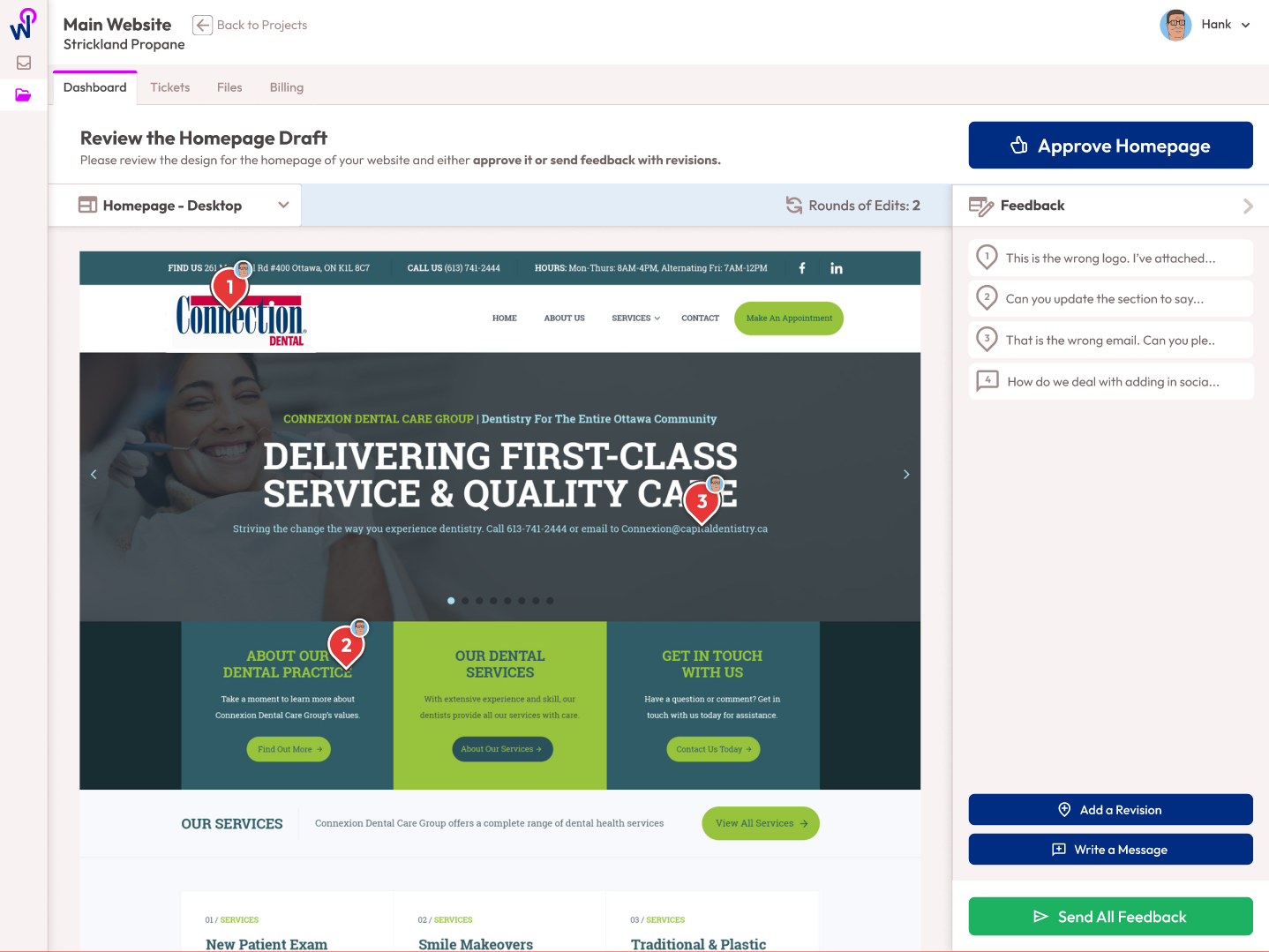
One of the biggest challenges for any creative project is providing easy-to-view proofs. We created a proofing tool that allowed clients to review website page designs and provide feedback through an easy-to-use pin-dropping and comment interface.
Project Manager Content Review
Project managers have the ability to vet content and information before the design process begins. Clients and PMs can engage in dialogue to ensure accuracy. This results in a single source of truth that can be easily referred to at any point in the project.
Admin Portal for Mass Project Management
The platform was engineered for maximum efficiency for project managers. With every step of creating a website automated, PMs can carry a much larger workload with way less effort and Admins have oversight on everything.
Creative
Branding
The application was designed for businesses that did not have a website, lacked the time to use a DIY builder, and didn’t have the resources to afford a fully custom design.
Since the target market was SMBs, it was determined that the WordPresto brand should be professional yet inviting. We aimed for the brand’s voice to reflect a commitment to delivering quality while making the process of building a website feel simple and stress-free.
A bright color palette was chosen, along with a flat illustration aesthetic. There was some debate about using photographs of people versus illustrations, but ultimately, the illustrations were a better fit as they gave the brand more personality.
Primary Colors
Secondary Colors
Illustration Style

